Redesigning the Environmental Registry
Citizens have the right to comment on environmental matters, but an outdated website made that nearly impossible.
A new user-friendly website was needed that centres citizens, plain language, and ultimately trust in government information.
Role
Lead content designer, co-UX designer
Organization
Ontario Digital Service
Client
Ministry of the Environment
The Environmental Registry of Ontario allows citizens to comment and voice their opinions on government decisions that affect the environment.
The problem was that the:
site was decades old with a confusing layout
postings were written in complicated, inaccessible technical language
tracking, notifications, and search were broken
Citizens couldn’t find what they were looking for, couldn’t understand what they were reading, and couldn’t trust that their comments were being received.
It was ripe for a rebuild.
Challenge
Before: old website home page with confusing layout, unclear directions, information, and calls to action.
Approach
My product team and I applied an agile service design approach (Discovery, Alpha, Beta, and Live phases).
As lead content designer and co-UX designer, I:
developed the content strategy (including the microcopy, voice, tone, and information architecture)
ran 7 plain language workshops to make sure postings aligned with new content standards (training 100+ internal staff)
analyzed Google Analytics data to identify trends (looking at bounce rates, time on page, and more)
27
interview sessions with 40 users, including citizens, senior leadership, law firms, and advocacy groups
11
personas created using interviews and user research
8
weeks of prototyping sprints to ideate concepts
Taking user research and interview data, I applied:
plain language throughout (increasing comprehension)
active voice (increasing reading speed)
content structures like subheadings and bullet points (improving scanability)
Content strategy
Information architecture
I used card sorting and first-click testing to develop the site's top-level navigation, making sure the structure reflected how users think about and look for information.
I wanted to focus more on the external user and not on how information is organized internally.
Information architecture visualization used for testing the navigation menu.
1 of 11 personas
1 of 11 personas
1 of 11 personas
Plain language workshops
The change management component of this redesign was so important to the new website’s long-term sustainability.
A large portion of the site consists of postings by internal staff. Taking them through a Plain Language 101 crash course, I:
explained web writing best practices
showed many before and after examples
led them through writing activities to solidify what they learned
Shifting from writing dense policy documents to writing for the web is tough. Even the smallest writing change that centres the user is a big improvement.
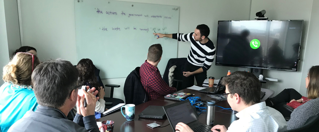
Me pointing out how to write in the active voice for easier comprehension and quicker reading.
A new-and-improved registry website, built and launched in 8 months, using agile methodologies.
It is now:
user-centred with clear language and straightforward ways to comment
at an average reading grade level of ”grade 10” (lowered from ”college level”)
responsive to fit any screen size (now in mobile!)
able to send users notifications about postings they follow and keyword alerts
We launched in Beta so that we could continue to iterate.
We collected users’ thoughts and opinions through a feedback survey. I then sifted through and found useful changes we could make and added them to our backlog in Jira.
Outcome
No clear start point, inaccessible hyperlinks, legal language.
Home page before
Clear call to actions and top-level navigation, recent and featured postings, quick information on type of posting and closing date.
Home page after
Dense, passive, and legally opaque walls of text, unclear next steps.
Posting page before
Clear language and plain language summary, most important information up top and scannable, "on this page" table of contents, better hierarchy and calls to action.
Posting page after
At 6 months post-launch, the amount of submitted comments increased by 11% and bounce rates dropped by 7%:
attributed to clearer language and improved user flows (call-to-action buttons, logical page structures, well laid out information architecture)
The number of days from initial drafting to posting of content by internal staff decreased by an average of 4 days:
attributed to backend CMS improvements and streamlined processes, like getting notifications that a posting’s comment period was soon closing
Our way of working became a model for future government digital products, as:
it was one of the first agile service redesigns
the focus on plain language made government information more accessible to citizens